Ever since Google Data Studio launched in 2016, their engineering team has been adding cool features to make visualization friendly, interactive, and more useful. The latest addition to the Data Studio family called “cross-filtering” is no exception.
In this post, you will learn how to use cross-filtering to improve the interactivity of your charts. In addition, we are also going to do a quick refresh on the drill-down feature in Google Data Studio.
Before we begin, if you want to explore different navigation features and how to make your reports user-friendly and visually appealing, you can take a look at our guide on Advanced Page and Report Navigation.
Now, let’s get started!
How does cross-filtering work?
In simple terms, cross-filtering lets you interact with one chart and apply that interaction as a filter to other charts in the report. When cross-filtering is turned on for a chart, you can filter the report by interacting with that chart in two ways:
- Clicking on the chart dimensions.
- Brushing or dragging a mouse across a line chart, time series, or area chart.
If you are used to applying filtering in all the regular controls, then you would easily notice that there’s not much difference with cross-filtering. For example, you can filter a Pie chart based on country dimensions and gets the same results as using a drop-down filter. Besides, you can also limit cross-filtering to certain groups, just like in other controls.
How to cross filter in Google Data Studio?
This feature is usually turned on for most of the connectors. However, it’s turned off for ads related connectors by default. For this reason, you need to turn it on manually. You can also turn off other connectors if you do not wish to use cross-filtering.
How to turn cross-filtering on/off?
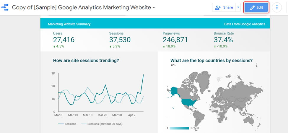
To use this feature, you need access to a report with an active chart. For instance, in this example, we will use data from the Google Analytics sample set. All Google Data Studio users have access to this demo data set. Here is what you have to do:
- Click the “Edit” button in your report.
- Choose the desired chart. In this case, the chart type is a map.
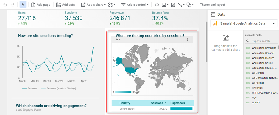
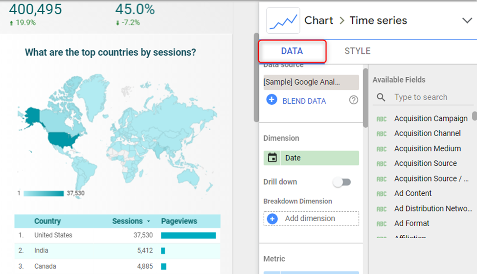
- Select the “DATA” menu on the right and scroll to the very bottom.
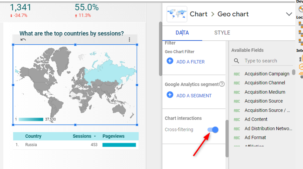
- From there, use the toggle to activate cross-filtering.
How to reset chart filters?
If you wish to reset a chart filter to its default position, the steps are as follows:
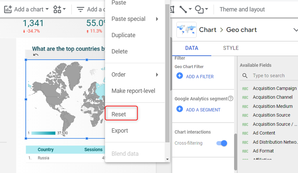
- Right-click a chart and choose the “Reset” action/
- Un-select the selected dimensions
- Click anywhere on the border of the chart you are filtering.
Chart interactions limitations
- The Cross-filtering feature is not available for bullet charts or scorecards.
- You are not allowed to cross filter using the “others” category.
- Cross-filtering has the same limits, just like other controls when it comes to filtering across data sources.
Allow users to drill down into your data
Another popular way to add interaction to your charts is to allow users to drill down into your data. This feature provides you with a way to reveal additional details in levels within a chart.
For example, if you want to reveal sessions by country and city, you can enable drill down on the chart. Turning this feature on will save you from creating two different charts for countries and cities.
Once you enable drill the drill-down feature, users can:
- Drill down to lower levels. For example, from country to city
- Drill up to higher levels. For example, from city to country.
You can reduce the number of charts required by using the drill-down feature. Besides, it makes it easier for users to find useful insights by navigating to various levels.
How to activate drill-down for a chart?
- Open a report and select a chart.
- Navigate to the right menu and click on the “DATA” option.
- Use the toggle to activate “Drill down”.
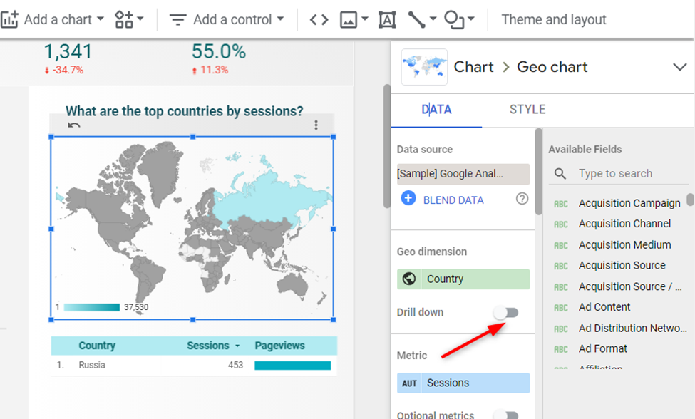
- Add levels of details by adding more dimensions. For example, you can perform the following geo breakdown:
- Sub Continent
- Country
- City
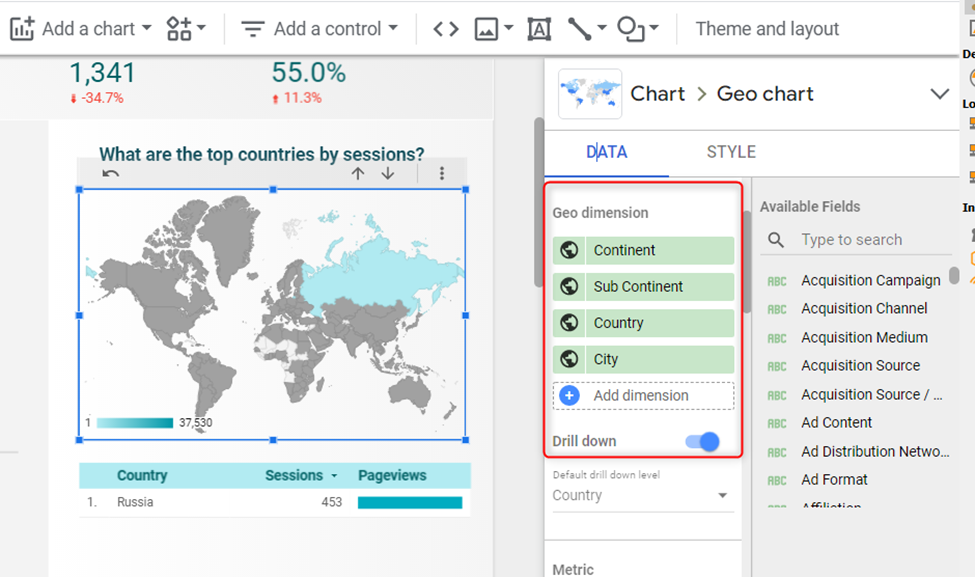
- Now choose the default drill down and make sure that is placed as your first dimension. (This is the level that shows automatically when users open your report)
How does drill down work under the hood?
First, you need to define a dimension hierarchy when adding a drill-down feature to your chart. The hierarchy dictates the detail levels your chart can display when users drill up or down. Examples of hierarchies include;
- Geography (Country>>Region>>City)
- Date (Year>>Month>>day)
- Google Analytics Events (Category>>Action>>Label)
- Product (Department>>Category>>SKU)
Note that the order of the dimensions is very important for defining a hierarchy. The best practice is to define hierarchies, starting with the most general dimensions down to the most specific.
For example, defining a day hierarchy starting with month, year, then date could produce undesirable results. This is because it lacks flow.
Another example is starting with country>>region>>city hierarchy. Here users will get undesirable results or get confused because you start with a general level, then move to a more detailed level, and back again to a general level.
Final Thoughts on Cross-Filtering and Data Drill-Down
Cross-filtering and data drill-down are just a few ways to make your reports more interactive. There are other controls that can put the power in your users’ hands such as metric sliders, so make sure you take a look at our other articles in the blog.
I hope this was helpful! If you have any questions on advanced data blending, feel free to subscribe to my newsletter or take a look at one of our courses.
Dynamic Dashboards and Data Analysis with Google Data Studio – 2022
If you want to learn how to build powerful data visualizations and unlock insights that can help you drive business results for your clients or employers, take a look at my full course on Udemy.

2 comments
When I set up drill down, it goes to the more granular item but doesn’t filter to the parent. I’m drilling campaign down to ad group, but I see *all* ad groups instead of the ones in the campaign I drilled into. How could I fix that please?
Did you get any reply to this?
Comments are closed.