Data visualization is an important tool for making sense of large amounts of data and communicating insights effectively. By visualizing data, we can uncover patterns, trends, and relationships that might not be immediately apparent from looking at raw data. There are many different chart types and techniques that can be used to visualize data, and the right choice depends on the type of data and the message you want to convey.
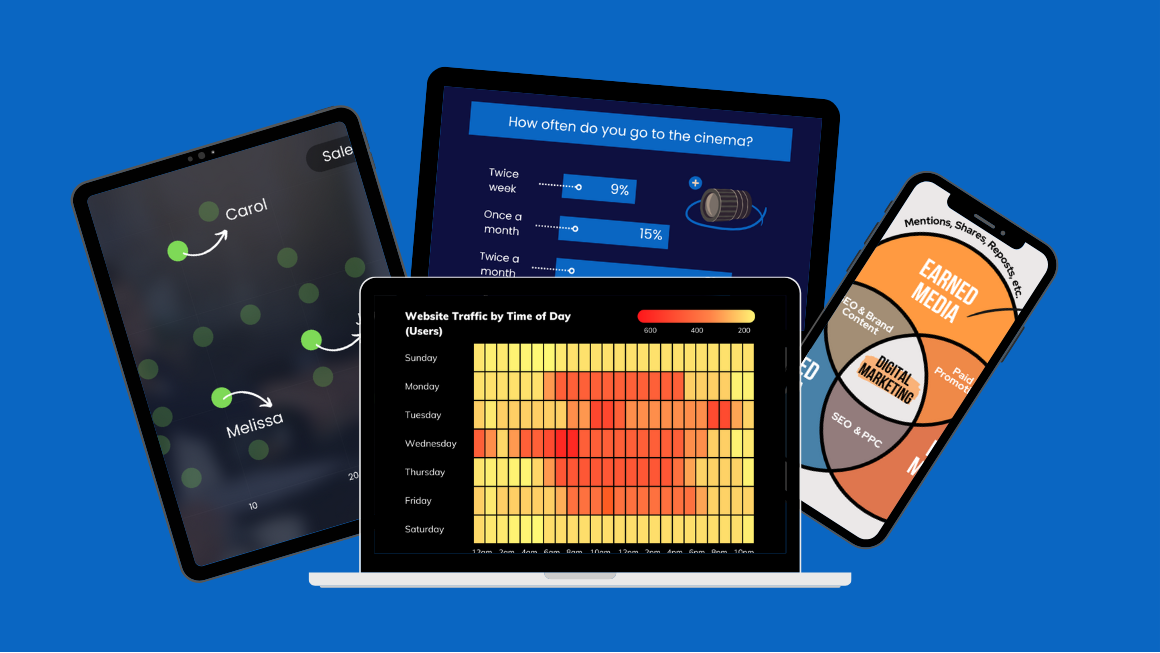
Here are 5 useful ways to visualize data, along with ready-to-use templated examples available through SkildLab’s Canva profile. Enjoy!
1. Line charts are great for showing trends over time.
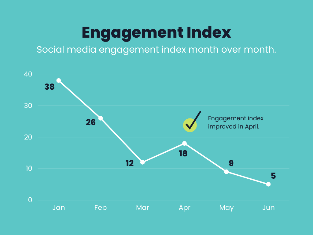
A line chart is a graphical representation of data that uses a series of data points connected by straight lines to display trends over time. It is used to display changes in data over a period of time or to compare different sets of data.
Line charts are useful for showing trends in data over a period of time, such as changes in a company’s stock price or changes in temperature over a week. They are also useful for comparing two or more sets of data, such as the sales of different products or the performance of different investment portfolios.
2. Bar charts are used to compare different categories or groups.
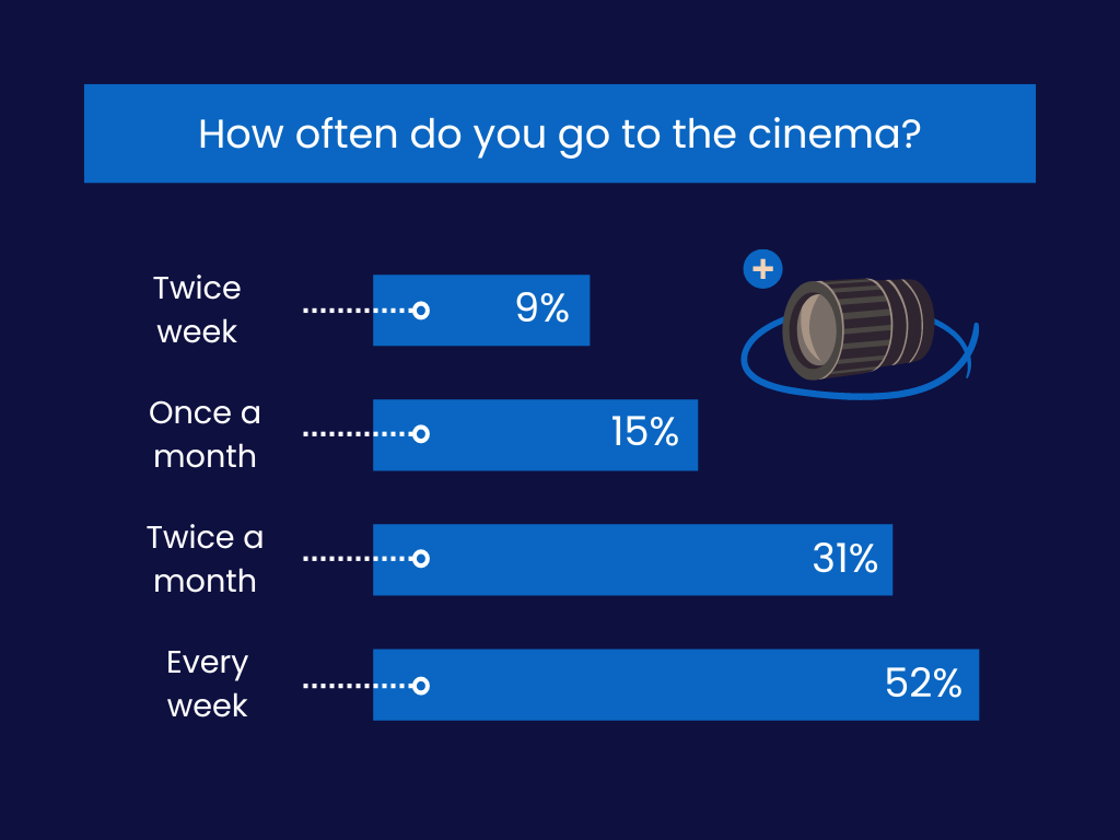
A bar chart is a graphical representation of data that uses bars of different lengths to display the values of different categories. It is used to compare the size or frequency of different categories of data.
Bar charts are useful for comparing the size or frequency of different categories of data. There are several types of bar charts, including horizontal bar charts, vertical bar charts, stacked bar charts, and grouped bar charts.
3. Pie charts are used to show how a whole is divided into different parts.
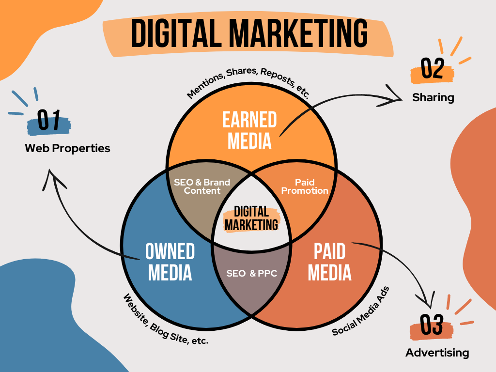
A pie chart is a graphical representation of data that uses a circle divided into sectors to display the proportions of different categories. It is used to show the proportions of a whole made up of different parts.
Pie charts are useful for showing the proportions of a whole made up of different parts. There are several types of pie charts, including regular pie charts, doughnut charts, and exploded pie charts.
4. Scatterplots are used to show the relationship between two variables.
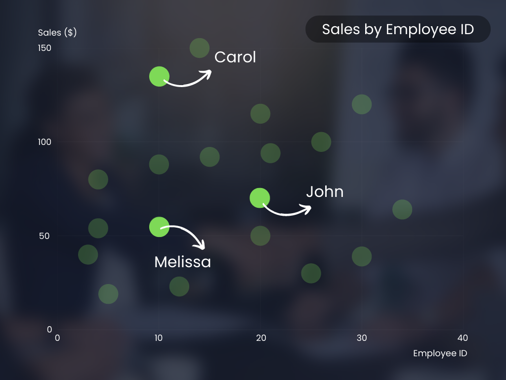
A scatter plot is a graphical representation of data that uses a series of dots to display the values of two variables for a set of data. It is used to display the relationship between two variables and to see if there is a correlation between them.
Scatter plots are useful for showing the relationship between two variables and for identifying any patterns or trends in the data. They are often used in science, statistics, and other fields to visualize and analyze data. There are several types of scatter plots, including simple scatter plots, bubble plots, and 3D scatter plots.
5. Heatmaps are used to show patterns and trends in data.
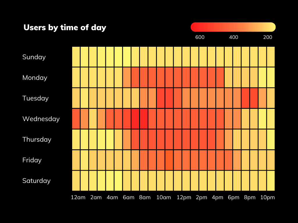
A heatmap is a graphical representation of data that uses a color-coded matrix to display the values of two or more variables. It is used to visualize and analyze data by showing the relationships between different variables and identifying patterns or trends in the data.
Heatmaps are useful for visualizing and analyzing data with many variables or categories. There are several types of heatmaps, including 2D heatmaps, 3D heatmaps, and hierarchical heatmaps.
Hope you enjoyed our short guide! If you have any questions, feel free to do one of the following:
✅ Explore my LinkedIn Learning courses on storytelling through data and design!
✅ Find out why Data and Visual Storytelling a the Skillsets of the Future.
✅ Subscribe to receive the by-weekly “My Next Story Is…” newsletter. Yep, it is my brand new newsletter!